How It Works

Our Fall Detection Algorithm uses a MATLAB accelerometer to collect the motion data, computes them, and visualizes the motion in three axes: x, y, and z. The data can be collected easily with a smartphone accelerometer including MATLAB accelerometer.
After collecting the data, upload it to MATLAB and use our algorithm to fit the acceleration curve of three axes to the curve for the fall acceleration curve, and get the r-square value to see how close the input motion data is similar to the experimental fall acceleration data. Using the r-square value, the algorithm detects if the motion is fall or not.
Experimental Data Collection
There are multiple cases of a person “falling”, starting from a simple fall because of tripping to a fully unconscious fall due to heart disease or external trauma. Among the causes of falling, this system will focus on the full fall. With that, the background information on falling “without consciousness” has a few cases to consider on its own - falling direction, sensor position, and medium of landing.
Falling has a variety of different variables that can be tied up to its data collection. For example, there is the side in which one is falling to - left, right, forward, or backward, as well as other types of falls caused by different methods. Also, the material of what the person is falling to has a diverse effect on the data collection due to the change in impact, and therefore the change in acceleration data. Finally, there is a difference in data collection according to the position of the sensor, so we need to unify where the data collection will be taken place, how we will fall, and where the sensor will be located on our body.
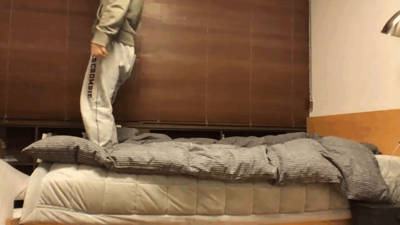
In this experiment, we decided to fall in all 4 directions, onto a bed with no springs - this would ensure the safety of the person imitating the falling, and would also be able to obtain data quicker. Each trial was done with the phone in the back pocket with the +z axis of the phone pointing the front and the +y axis pointing the ground and carried out 5 times per each side of the fall to get an average of the acceleration data to ensure data integrity. Each fall was conducted for about 8-10 seconds, and unnecessary movements that were recorded after the fall due to the tester getting up too fast or twitching was erased. There were more than 25 tests conducted, with 5 tests invalid.

The testing data was then taken with a different person from the tester. The tester did a series of different movements, such as falling in a random way and walking to provide validation data for testing. This tester had fallen onto a bed with a similar texture with no springs, and the position of the sensor was also in the back pocket to ensure similarity in the collection.
Image from MathWorks
DATA CLEANING
The accelerometer data presents some insight into what we should do from here onwards. The graph shows that there is some oscillation before the fall, highly possible because of the movement of the phone from the experimenters hadn’t to the back pocket. Then, there is a big change in accretion in a short period of time, in both x, y, and z-axis. The shape of the abrupt change differs by axis and side of fall because The orientation of the phone differs. There is extra oscillation afterward with the phone moving to stop the recording. From this, we can see that we should crop out the time periods of moving the phone and filter it down to erase unnecessary movements to get only the needed motion. Also, this tells us we cannot average the axis to find a common property of a fall due to the change in orientation during the fall.
With the obtained data, we managed to clean up the residue shaking and acceleration by plotting the signal and taking out parts that were not involved with falling directly, matching it up to the video we had taken of each fall using timestamps in the data. This allows us to look at the trends of the acceleration data much easier than the others because it included unknown movements that we cannot specify, and is not uniform in any of the collected data. This was done manually, throughout the 20 experimental data.


Plot before cleaning the data
Plot after cleaning the data
filtering
We first tested the usage of Fourier transformation to the falling data. This required us to filter the data, and because we had a lot of noise in the background, we used the three-point average filter with the equation (written below) to filter out the noise. We did not use the high pass filter because the three-point moving filter had cleaned the graph enough for us to continue. This filtering technique was applied for processing all data from this point onwards, to reduce the risk of creating flawed data for the fitting process and comparative process.


Plot before filtering the data
Plot after filtering the data
Fourier Transformation
With the filtering complete, we soon realized that the Fourier transformation is a bad indicator of a person falling because the Fourier transformation is used to find the frequencies, which is more appropriate for period movement than non-period movement. This was then taken into further research, and we confirmed that this was indeed the case by running Fourier transformations on all 20 tests, which concluded that the notable frequencies were generally random in the frequency themselves and the amplitude that the frequencies had. The graph indicated multiple frequencies that are detected with the same type of fall, which indicates that the result is random, therefore unusable. We compared the plot with the Fourier transform of the walking motion, which is more periodic, and confirmed that To confirm that our Fourier transformation code worked, we ran the walking test and it returned the expected frequencies without a hitch.

Fourier transformation of fall
- There are no specific frequencies that are common
- The amplitudes vary even though they are from the same type of fall and axis
- No common patterns
- No specific frequencies to focus on

Fourier transformation of walking
- We can clearly see the frequencies that matter
- The filter data has significantly less area below the curve, unlike the plot above
- We can find distinct points in the plot to use as reference points for comparison
- Data looks similar to the walking plot from the in class exercise
Accelerometer Data Alignment
After manual data cleaning, we noticed that the data would not be very easy to use to find patterns and therefore a trend that acceleration signals show when a person is falling. We decided that the difference between each signal would have to roughly align with each other to make the trends become plausible. With the cleaned-up data, we took a sample signal from the 5 tests of the same side fall and aligned the rest of the signals to have a set of data with similar trends that we could analyze. The analysis of each signal was then checked by eye, and although there were a few misaligned data, we found out that this was trivial in terms of the data processing that we were going to perform with the collected and aligned data. At this phase of the program, the aligned data was changed from a timetable into a table, then into a double matrix that could present us with usable and accessible data. This process was done with all 20 experimental data and was also used with the validation phase where we had to align the validation data with the testing average signal to compare the results.

Aligned data of the same side of fall
Curve Fitting using gaussian equations
With the aligned data, we take the average of the 5 data per each side of the fall. This will allow the generalization of each fall, although there isn’t enough data so that it would create a level of generalization we want. With the averaged data, we use the gaussian equation to create a general fit of the four sides. This trend had applied to all 20 of the experimental data, of 4 averaged data which resulted in creating 15 different trends in each of the 4 types of falls. This is because each fall has the accelerometer data of axis x, y, and z, which enables us to find a trend of the validation data a little better than with only one axis. This is because depending on the side you fall to, the sensor picks up what largest change in different axis - for example, falling sideways and falling forward has a different effect on the accelerometer because falling sideways has the largest change in the axis z, whereas falling forward has the larges change in the value of axis x.
With the 3 axes of 4 sides fitted with a curve using the gaussian equations, we went over the goodness of the fitting by the gof values provided by Matlab, which indicated that for 80% of the fittings, the quality of goodness was over 80%. This was a reasonable result, considering that we had to fit different types of data within one gaussian general equation. We did consider using multiple different general equations form matching the data, but after multiple tries with different types of general equations and degrees, we concluded that the equation with the least amount of errors given by the gof was the one we used in our final test.

X-axis fitting of Fall Left Data
The blue dots are the average of the 5 experimental data of the x-axis - and the red line represents the computed fitting equation.

Y-axis fitting of Fall Left Data
This is the average of the 5 experimental data of the y-axis - and the red line represents the computed fitting equation.

Z-axis fitting of Fall Left Data
This is the average of the 5 experimental data of the z-axis - and the red line represents the computed fitting equation.
Matching Data
The fitting of the data created multiple graphs - when we looked through them, none of the sides had a common trend other than a sudden change in the acceleration data. This meant that we could not generalize the pattern of a ‘fall’ perfectly, as we wished to do so in the start. Due to this, we decided that to determine if there was a fall, we would need to compare it to the data of each fall to see if there is a match, and if there are no matches in all four of the falls, the validation data is not a fall.
With each individual trend of the x y z in the four sides of falls, we are now able to match the validation data with what we have to determine if the validation data is a signal of someone falling - and if so, which side they are falling to. To do this, we take the validation data and align it with the averaged plot points of each side to ensure that the trend matching will not happen with different starting points in the pattern. This was done every time the validation data was compared to each trend. After the alignment, we took the R-squared value of the trend data and the validation data, which resulted in the correlation between validation data and the trend. To see what was an acceptable value that would let us understand that this was a fall, and a specific type of fall, we took one of the experimental data and ran it through the program to see the output. We determined that the acceptable required value was about 1-2 when we added all axis together. The result showed that the correlation was not amazingly accurate, but signals that were incorrect generally returned a negative required value for the sum of all 3 axis’ r-squared values, which made it easier for us to confirm which type of fall it was if it even was a fall. If it wasn’t a fall, all required values returned negative.
If you want to know more about the algorithm, go to the Github link at the bottom of our website.